Right This Way: The Importance of Wayfinding and Environmental Graphics for Your District Campus

Wayfinding is more than just signage - and a thoughtful approach to both is necessary for educational campuses
Imagine your child is the star of their high school sports team. You are all set to attend the event that will seal their spot in the sectional championship. You Google the address of the school where the final match will be held, you’re late leaving a meeting at work, and – to make matters worse – you’re caught in traffic on the way there. Finally you arrive on the campus just at the start… only to find that you entered the wrong parking lot and the event is across campus! You wonder if you can cross the fields on foot or if it would be faster to drive down the side roads. You wind up taking the car, pull into the correct parking lot, weave through the aisles to find a spot that’s not on the lawn (mud), and by the time you reach the stands…you’re too late! You’ve missed your child’s shining moment on their “field of dreams”.
Such is the problem for many educational settings, be it the campus or school interior. Stressful situations are made worse when they occur in unfamiliar surroundings. Wayfinding is one of the most overlooked aspects in the design of the built environment, but is often one that delivers a crucial contribution to the health, safety, and welfare of the public. A proper wayfinding strategy can clearly identify areas by function, restrict access to secure or potentially hazardous areas, and direct first responders to a location. According to the Society for Experiential Graphic Design, wayfinding “refers to information systems that guide people through a physical environment and enhance their understanding and experience of the space.”
“Is this Heaven? No, it’s [Intuition]”
While signage is often considered the primary solution to a wayfinding problem, design professionals have other options in their toolkit. Designers can craft a multi-layer wayfinding approach that helps empower occupants and visitors to make efficient navigational choices to their destinations. The clearest wayfinding is non-verbal; it uses the intuition of the occupant by means of visual indicators. Changes in scale and volume, color accents, and lighting are essential to placemaking. A common obstacle to efficient wayfinding is the failure to make spaces within a facility look unique. Creating an identity for spaces helps the users feel a deeper connection to their surroundings, which, in turn, heightens the value of the programming the facility offers. In the design of new buildings and major additions, the arrangement of spaces and lines of sight are key to the success of keeping visitors on the most efficient route of travel. An environment that simplifies the path to destinations without the use of text facilitates user access and is more inclusive for those that are differently-abled and culturally diverse.
Still, due to the complexity and size of today’s educational settings, signage is a must-have element in a campus wayfinding strategy. In signage design, tools such as maps, color, text, and symbols are essential to orient the occupants within a building and lead them on their route. Design professionals must have an understanding of the building code as it applies to signage as a precursor to the design of a wayfinding project. Factors such as the height of the text in comparison to viewing distance, font, pictogram type, and the sign material are all items that are regulated by the building code.
Working with the stakeholders to establish the key destination points and the hierarchy thereof is a critical first step in the process of the wayfinding program. The goal of directional signage to these destination points is to limit the information while maximizing the context. Too much information may lead to confusion and delay decision- making at high traffic intersections.
LaBella’s design team for the Canandaigua City Schools 2020 CIP took these practices into account for the design of Canandaigua Academy’s exterior wayfinding signage. The team devised a family of signs based on an analysis of arrival, departure, and decision points on the path of travel for the campus. Typically, a proper sign system must include four categories of signs: identification, direction, orientation, and regulatory. In the case of Canandaigua, LaBella used identification signage to denote the locations of each of the twelve athletic fields on the campus. A series of directional signage was planned at four entrance points to the campus which then sequenced to signs within the three parking lots, and ultimately led to the school building and athletic facilities. Campus map signs were documented for both vehicular and pedestrian traffic at major intersections and at divisions of space. Regulatory signage was specified by the civil team members for traffic and accessible parking, as well as messaging for campus rules and regulations. With a cohesive and comprehensive signage system, visitors to the campus will be empowered to make appropriate navigational decisions rather than requiring help and delaying event arrival.
To further enhance the signage package and architectural design, environmental graphics can be used. Environmental graphics involve the use of large-scale imagery and multisensory user interaction. Instead of standard one-way communication, changeable content, lighting effects, touch activation, and motion are all techniques used to captivate the viewer and enable them to be an active participant in the transfer of information. These graphics are a supplemental approach to support efficient wayfinding and craft an overall design language. Environmental graphics provide the opportunity for an organization’s brand to be highlighted in the physical space for a cohesive experience. They range from 2D applications to digital installations; from small and subtle to large and human scale. In the case of educational facilities, the use of branding in architecture appeals to the sense of pride of the students and staff. It helps the users feel more connected to their surroundings while enabling a sense of community.
The design team on the Arkport Central Schools 2019 CIP used environmental graphics to denote the function of spaces in the historic portion of the building. Existing structural glazed tile pilasters were reimagined as a display surface for Arkport’s Bluejay mascot branding. The pilasters in the corridor spaces changed from a neutral color to blue as a signal to the occupants that they were approaching the new Gym and Fitness Center.
When thinking of your campus and school buildings, how is it that you want your organization to be remembered? Effective wayfinding creates a positive first impression that is unique to who you are. It delivers the message and values you want your organization to reflect. The effect on the well-being, safety, and security of the occupants alone offers a high return on investment.
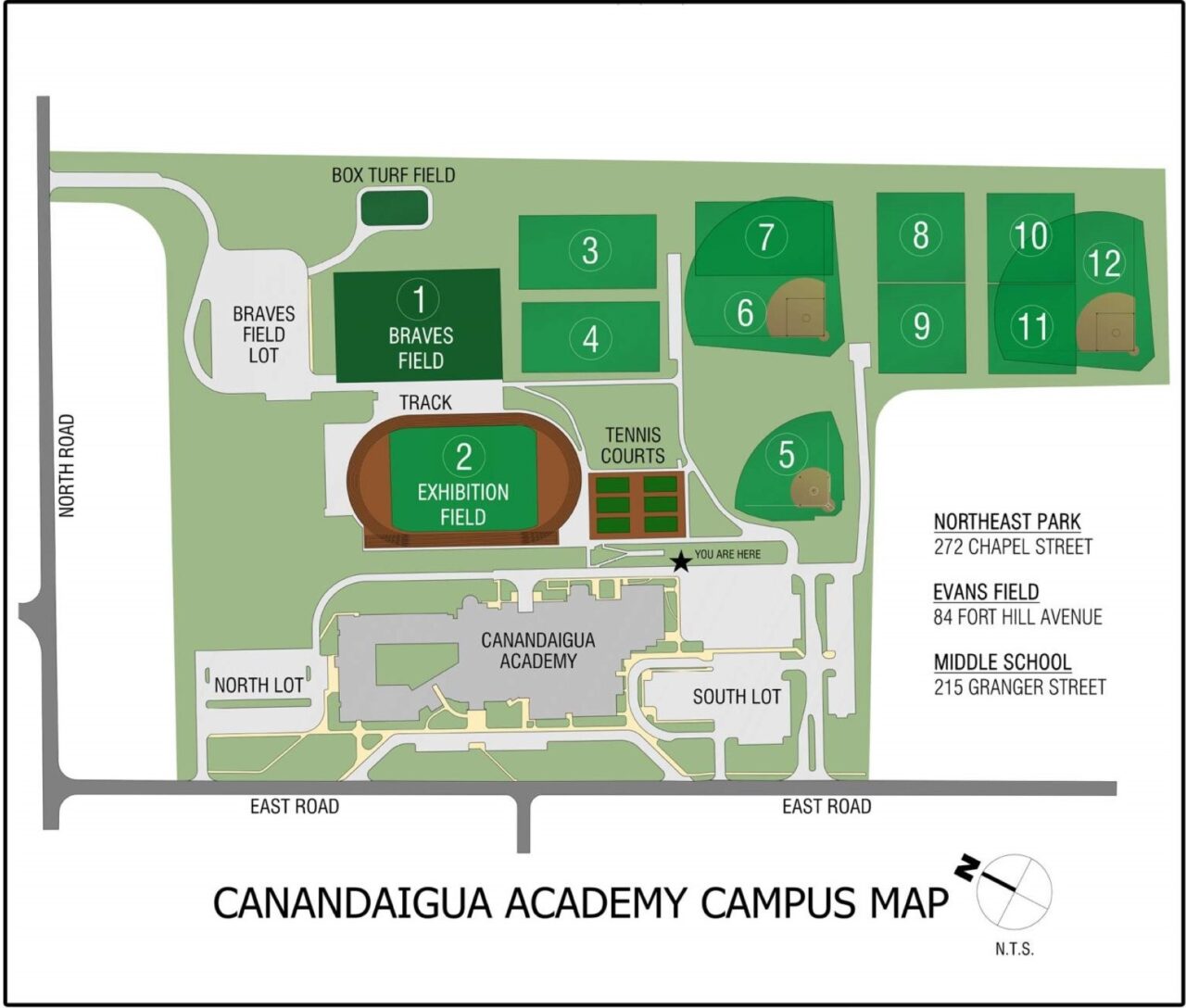
Academy Exterior Wayfinding – Campus Map
Arkport Central Schools
In the case of educational facilities, the use of branding in architecture appeals to the sense of pride of the students and staff. It helps the users feel more connected to their surroundings while enabling a sense of community.
The design team on the Arkport Central Schools 2019 CIP used environmental graphics to denote the function of spaces in the historic portion of the building. Existing structural glazed tile pilasters were reimagined as a display surface for Arkport’s Bluejay mascot branding. The pilasters in the corridor spaces changed from a neutral color to blue as a signal to the occupants that they were approaching the new Gym and Fitness Center.